
Commercial Communications Council
He Tāngata | The People
Belonging among unlike minds. An inclusive creative identity.
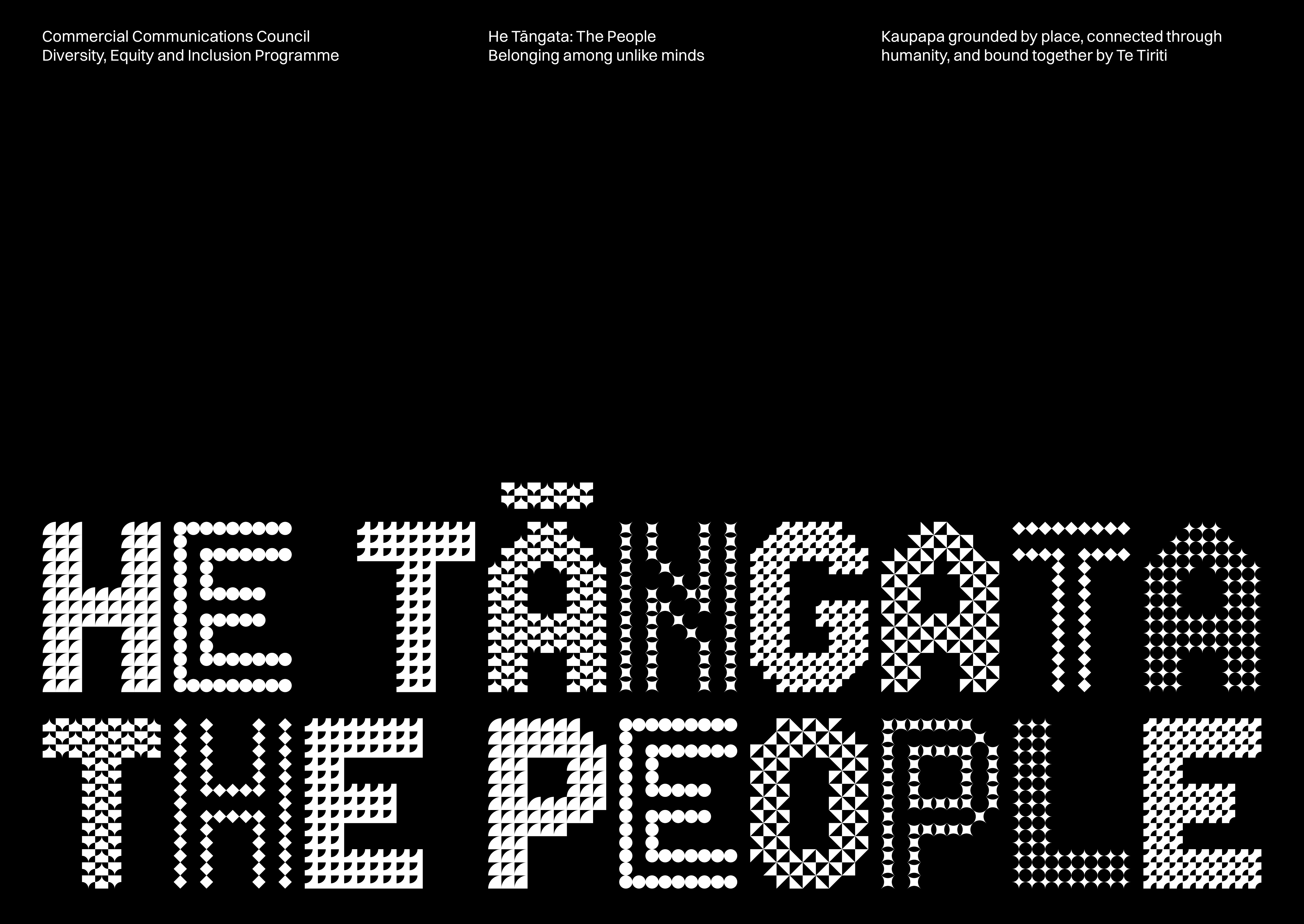
We addressed the challenge of universal representation with a system of geometric shapes. Familiar and unfamiliar forms – circles, squares, triangles, and their derivatives – combine to create new expressions. Each shape retains its integrity, symbolising that individual identities are celebrated and strengthened within a collective.
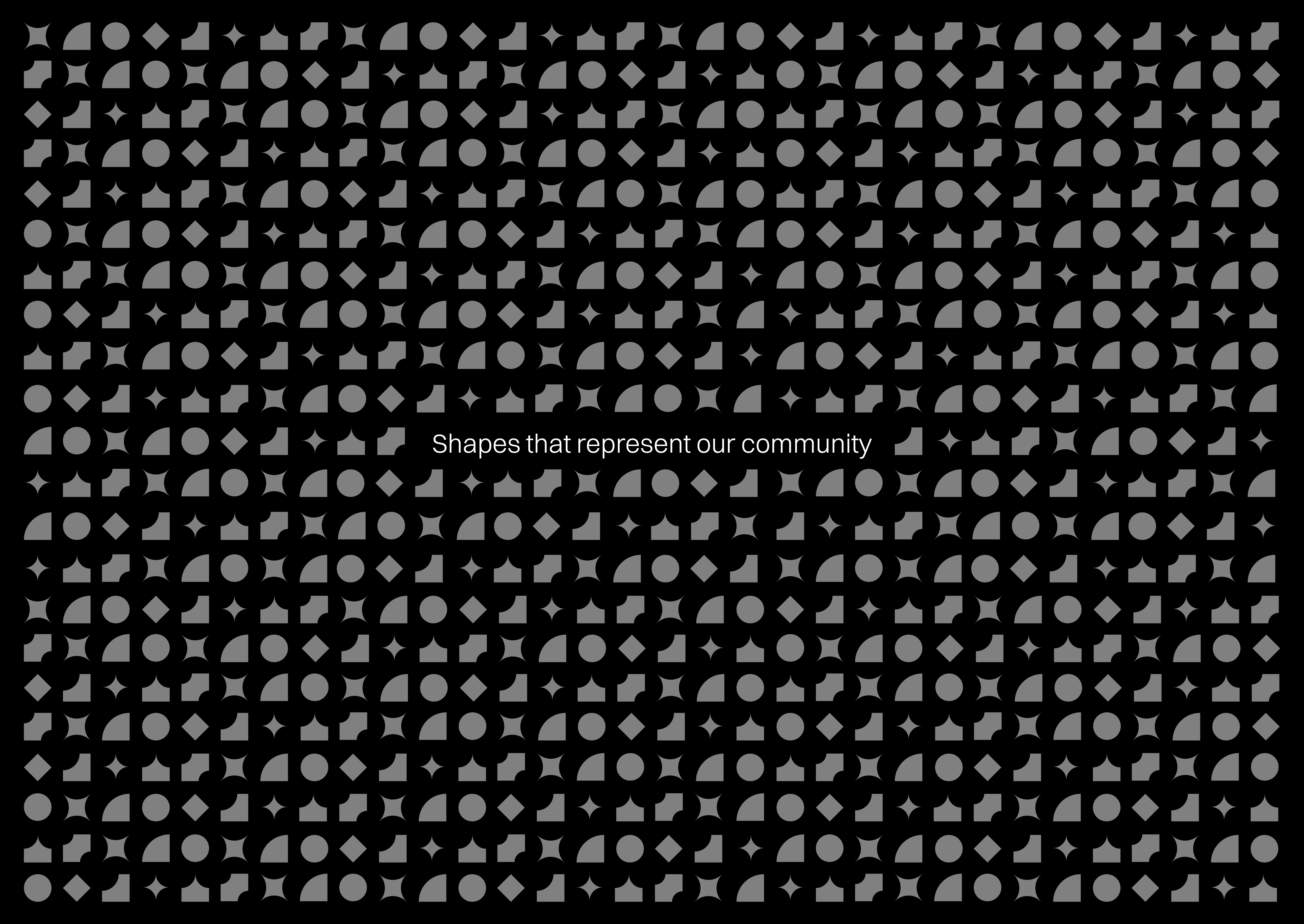
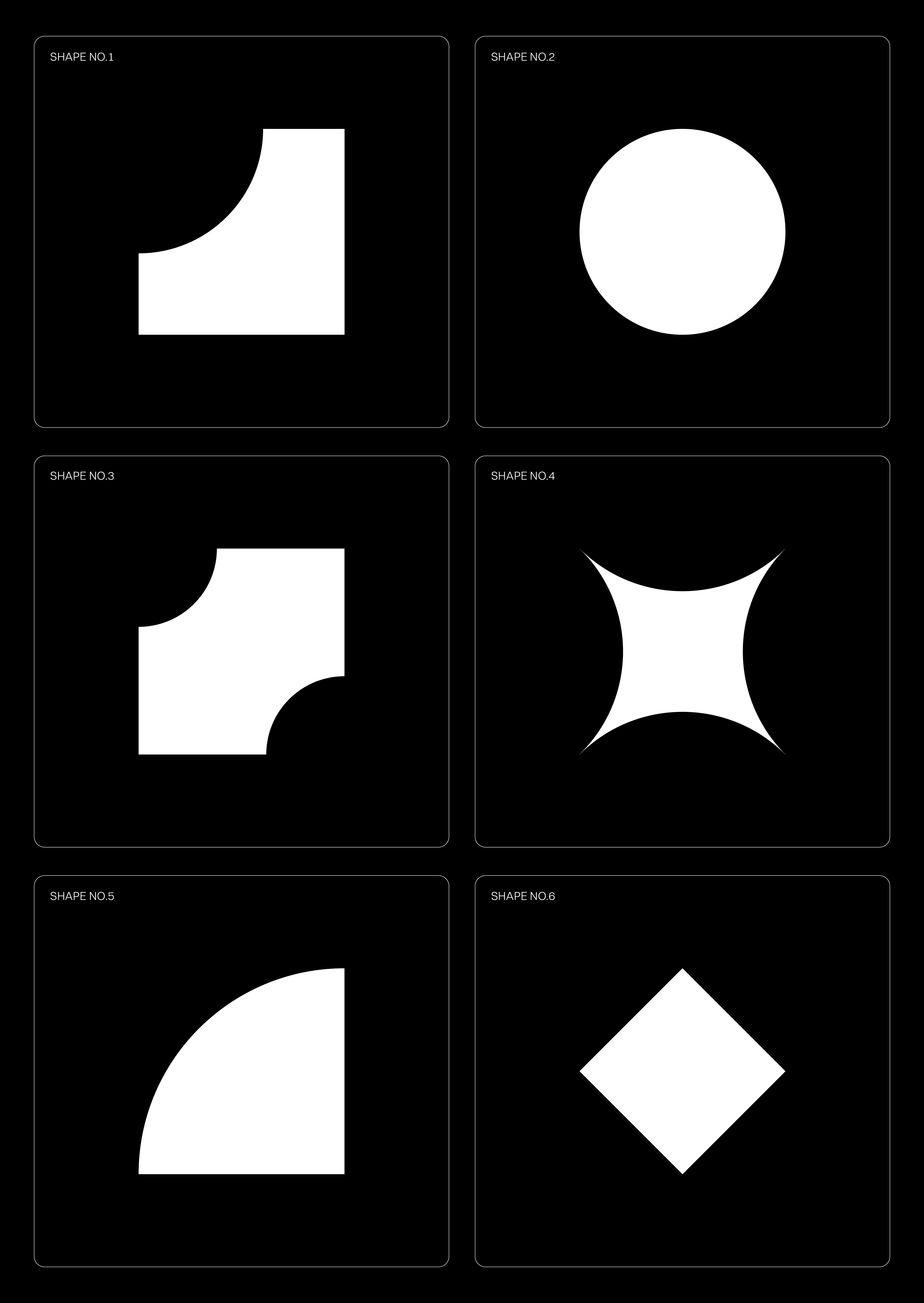

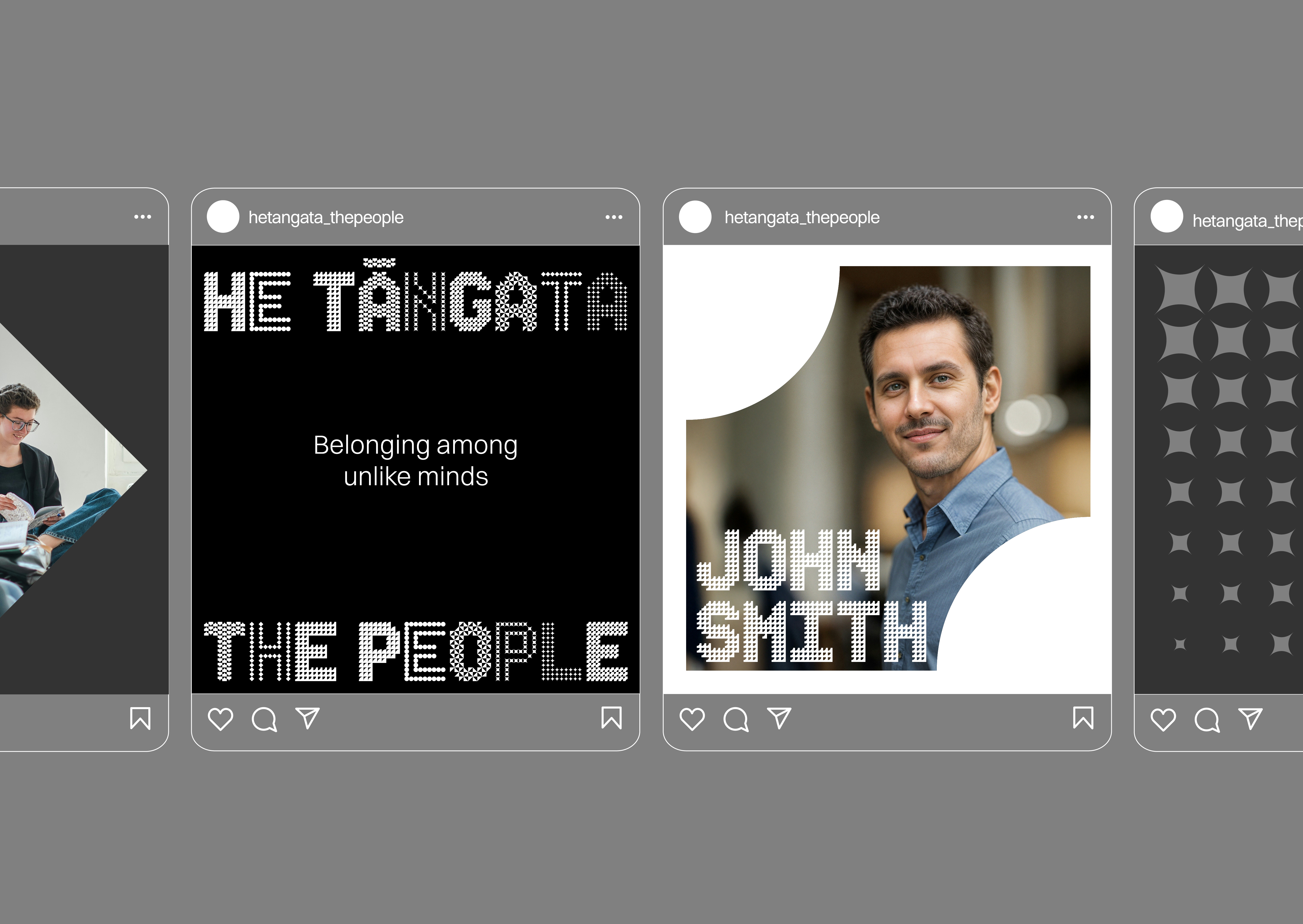
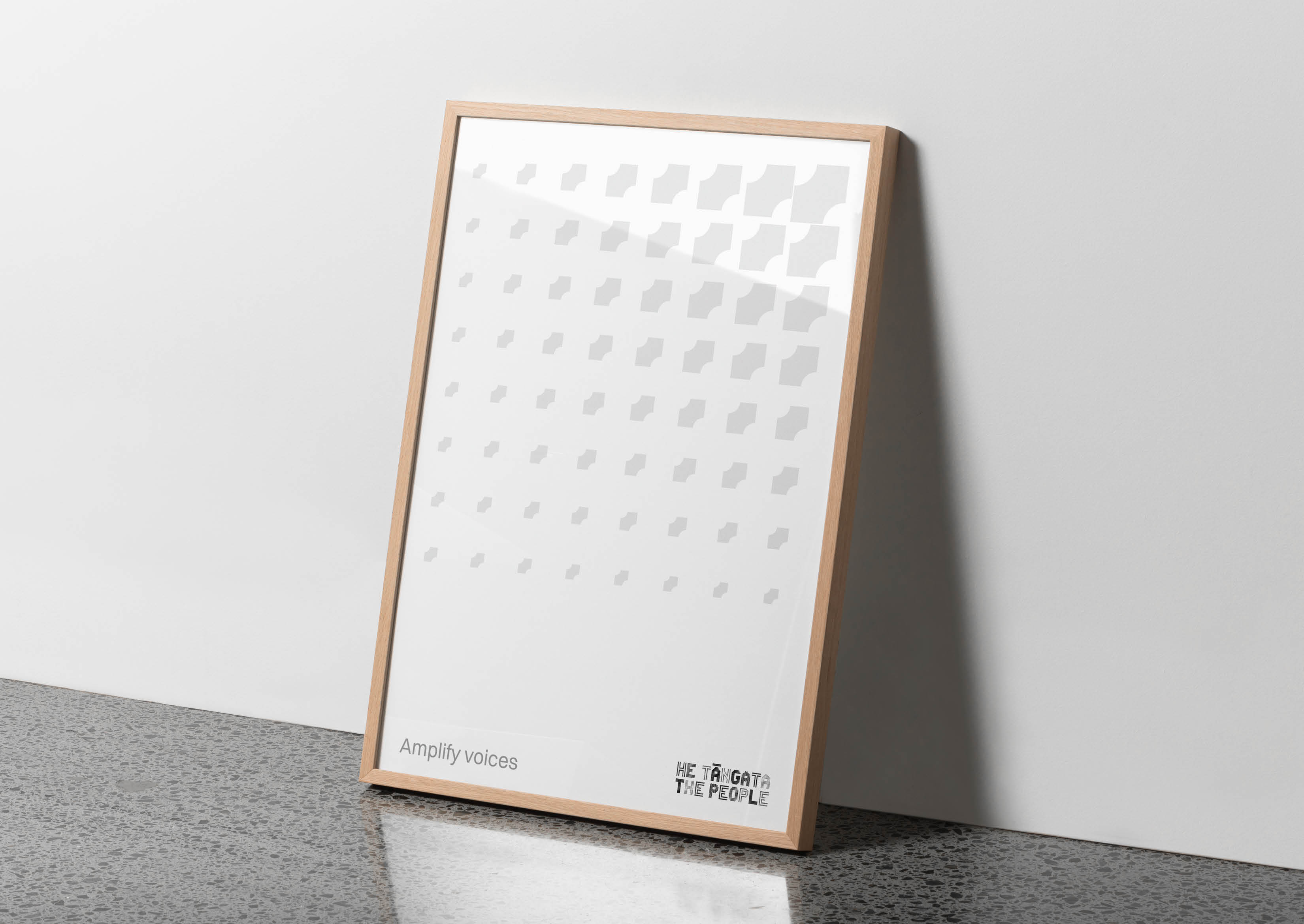
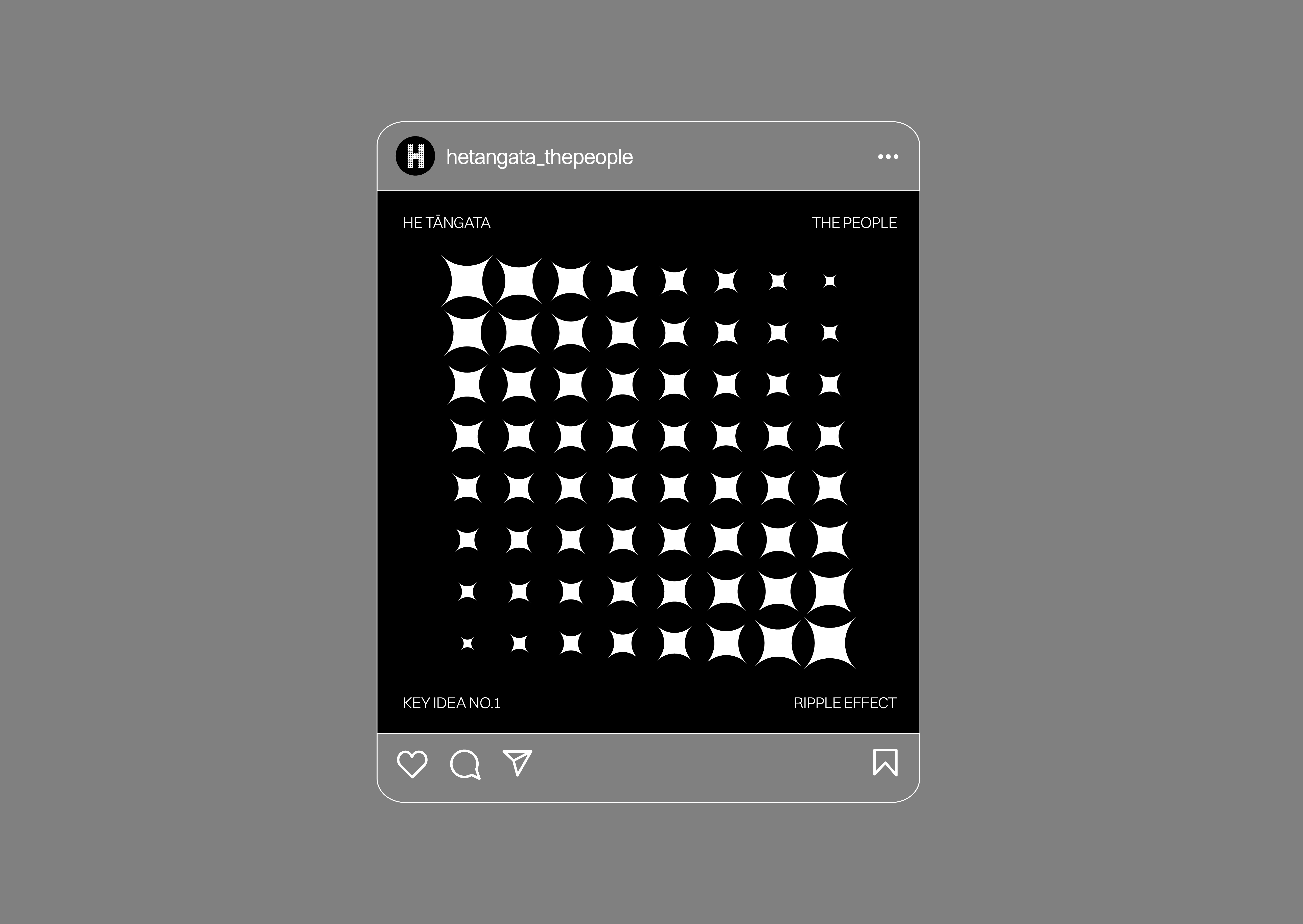
Beyond static visuals, we developed dynamic textures from these shapes. These are active graphic devices: amplify voices, ripple effects, connect people, and spark ideas. These textures provide depth and meaning, functioning as both graphic devices and background elements.
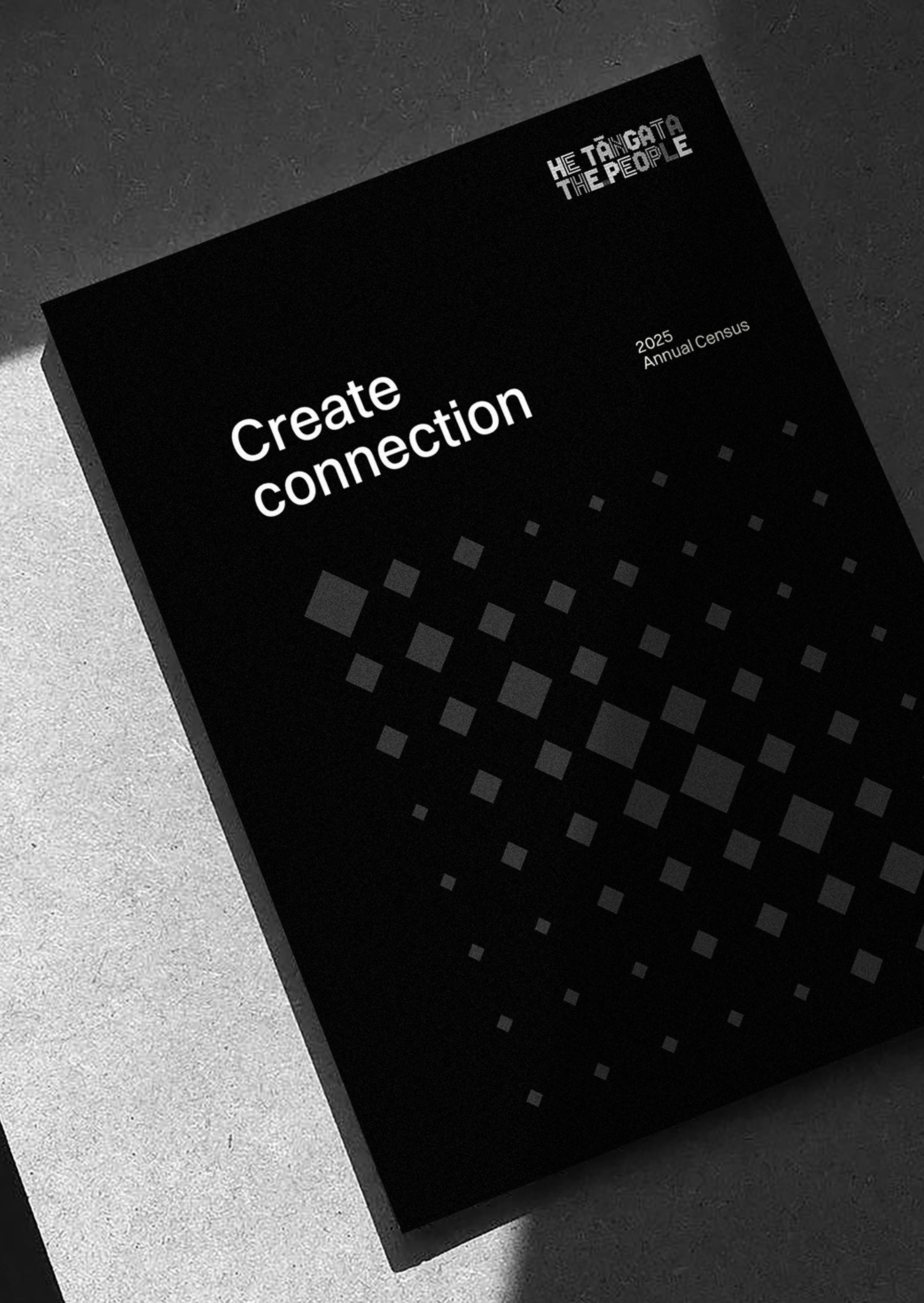
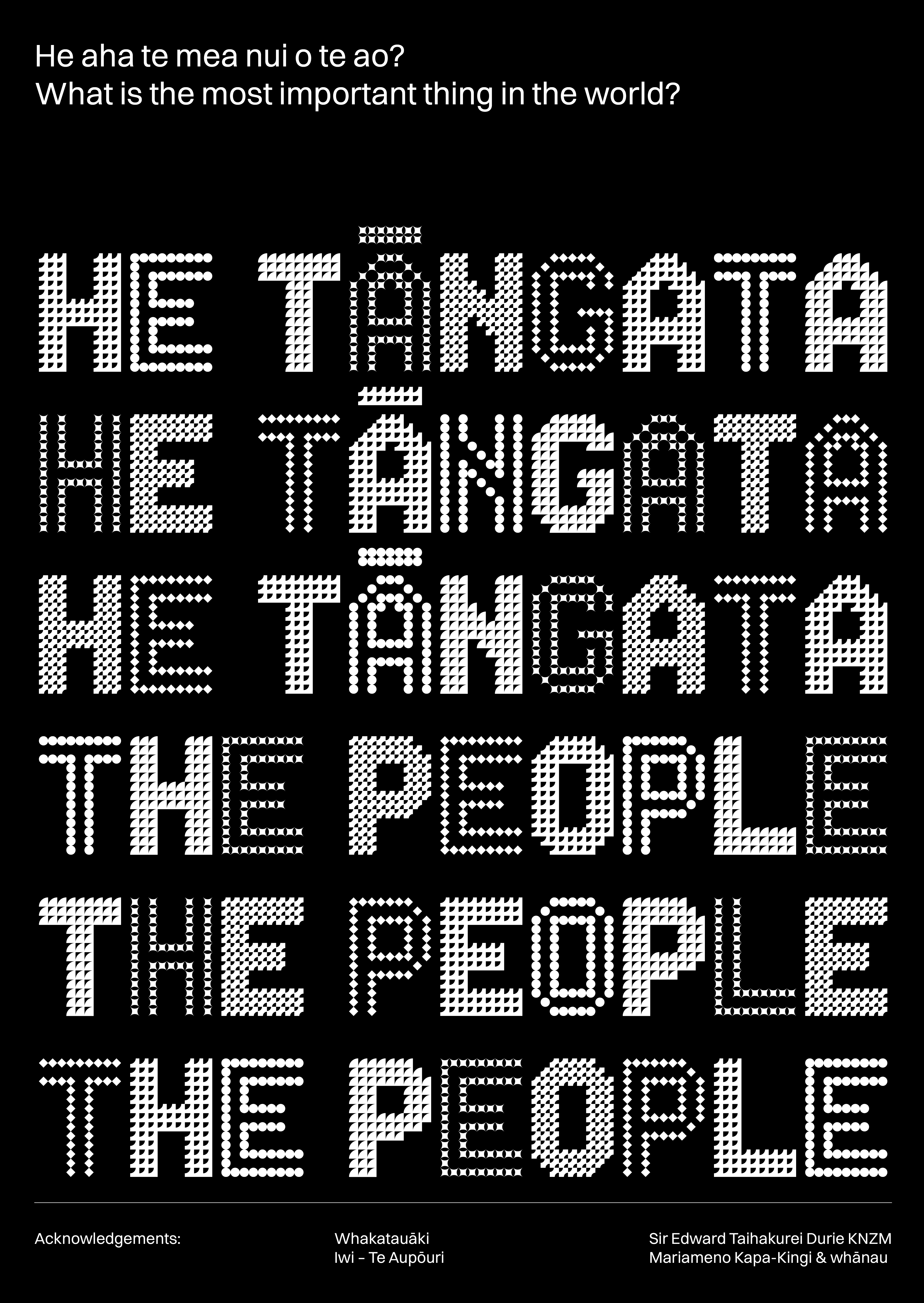
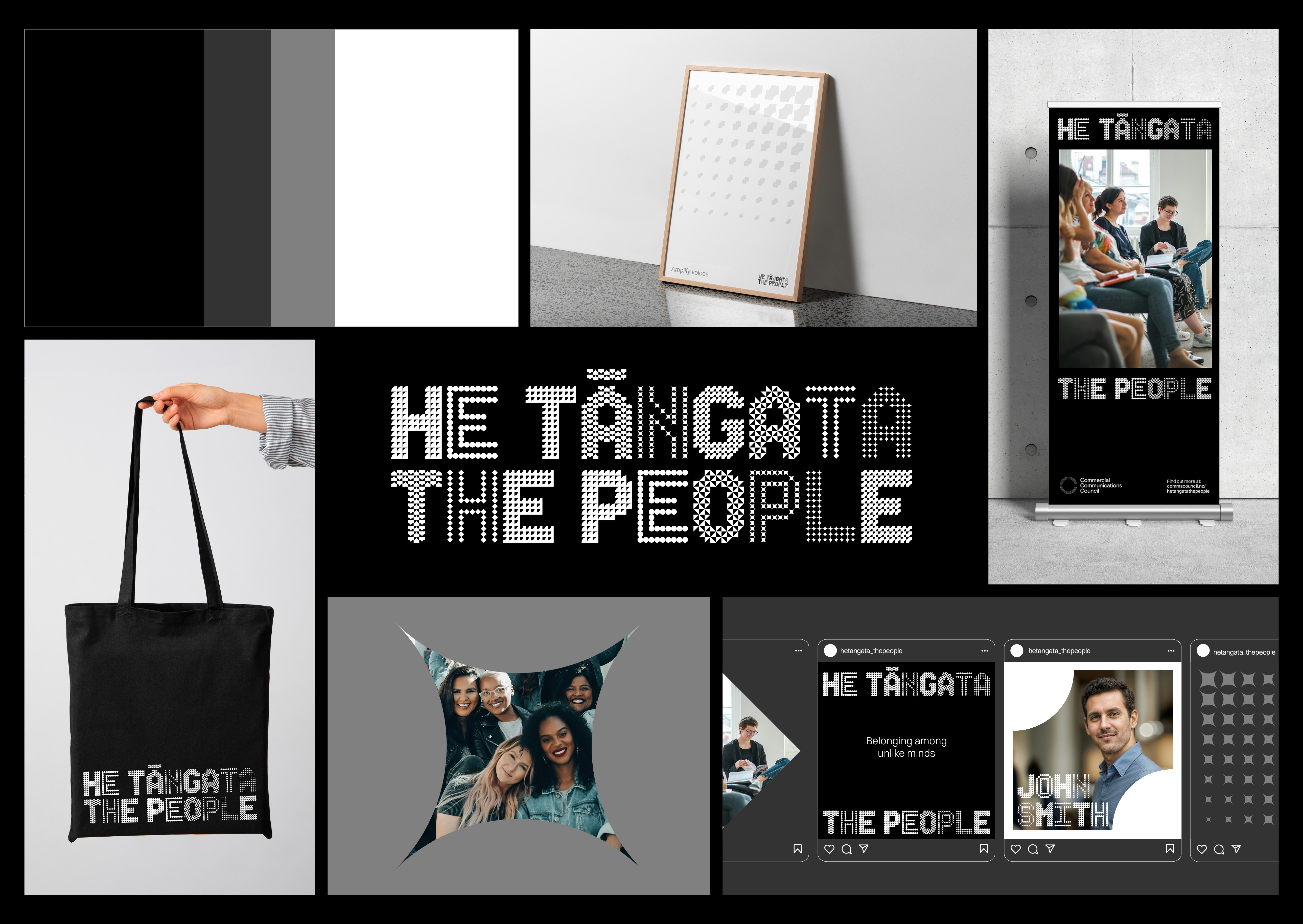
The core of the brand is He Tāngata | The People. This Māori whakatauki defines the initiative – "What is the most important thing in the world? It is people, it is people, it is people". Our logotype translates this philosophy into a strong, contemporary, and iconic visual. Constructed from the same geometric shapes, it creates a modular aesthetic that speaks to interconnectedness and collective strength.
Whakatauāki Acknowledgements:
Iwi – Te Aupōuri
Sir Edward Taihakurei Durie KNZM
Mariameno Kapa-Kingi & whānau
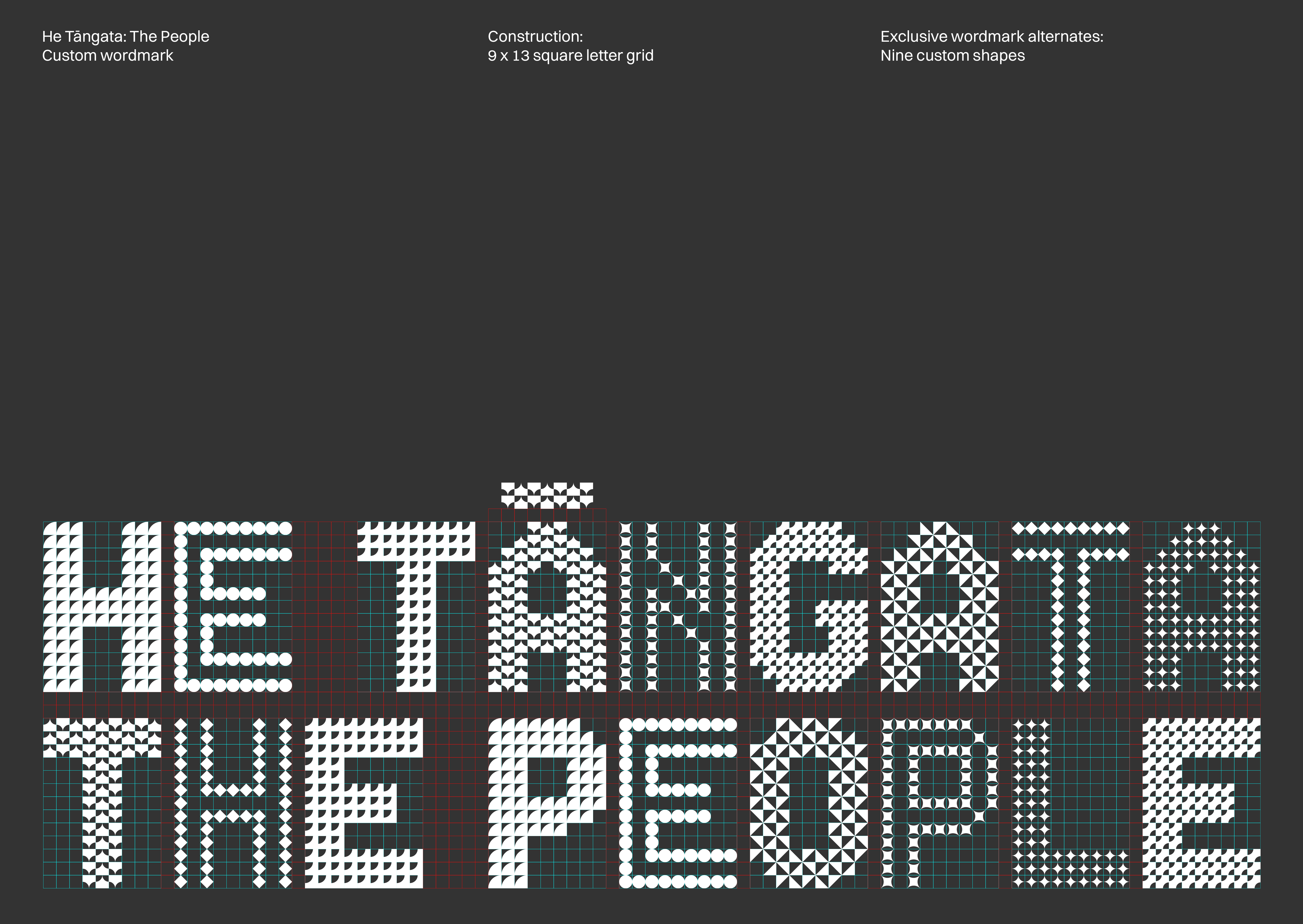
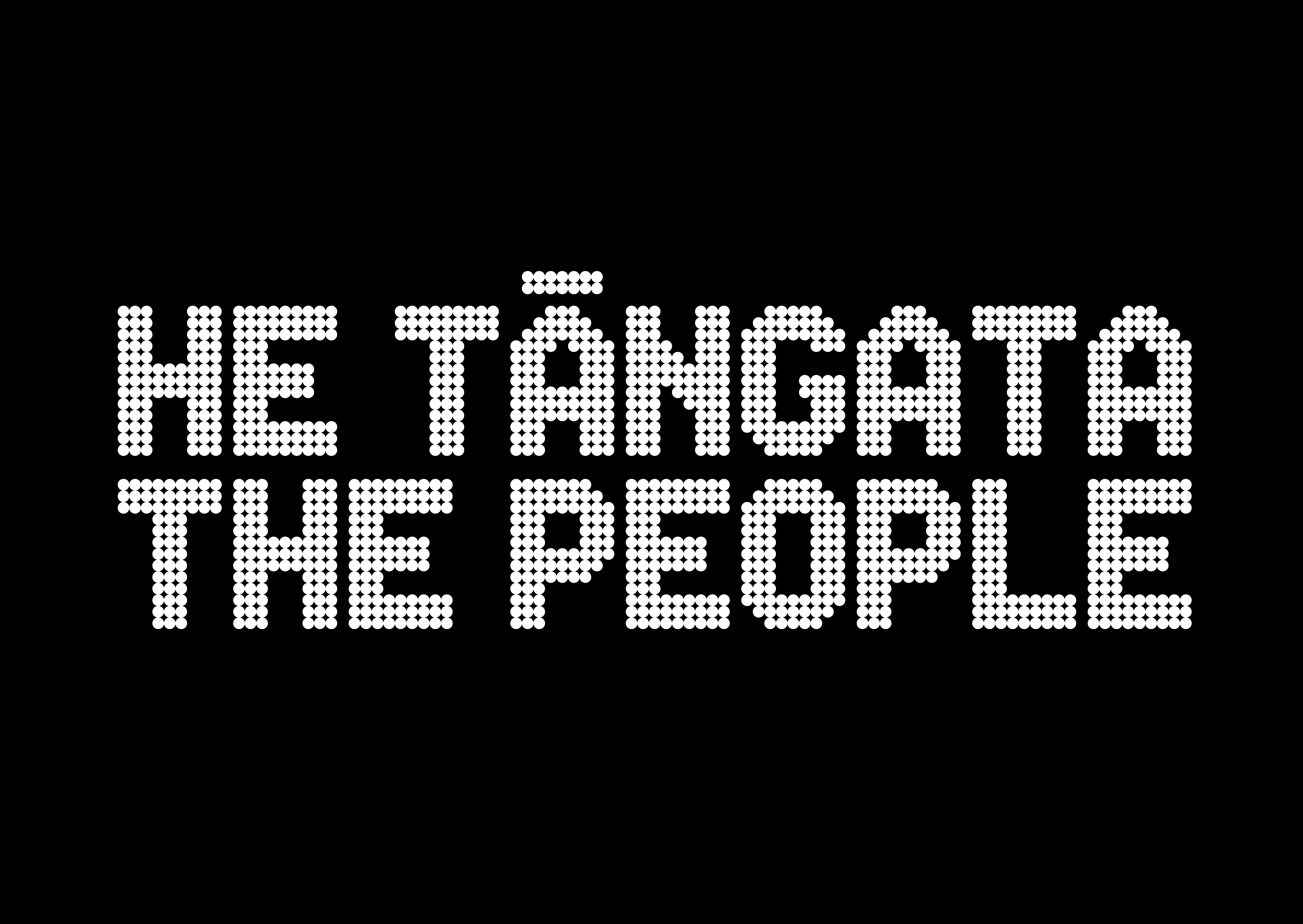
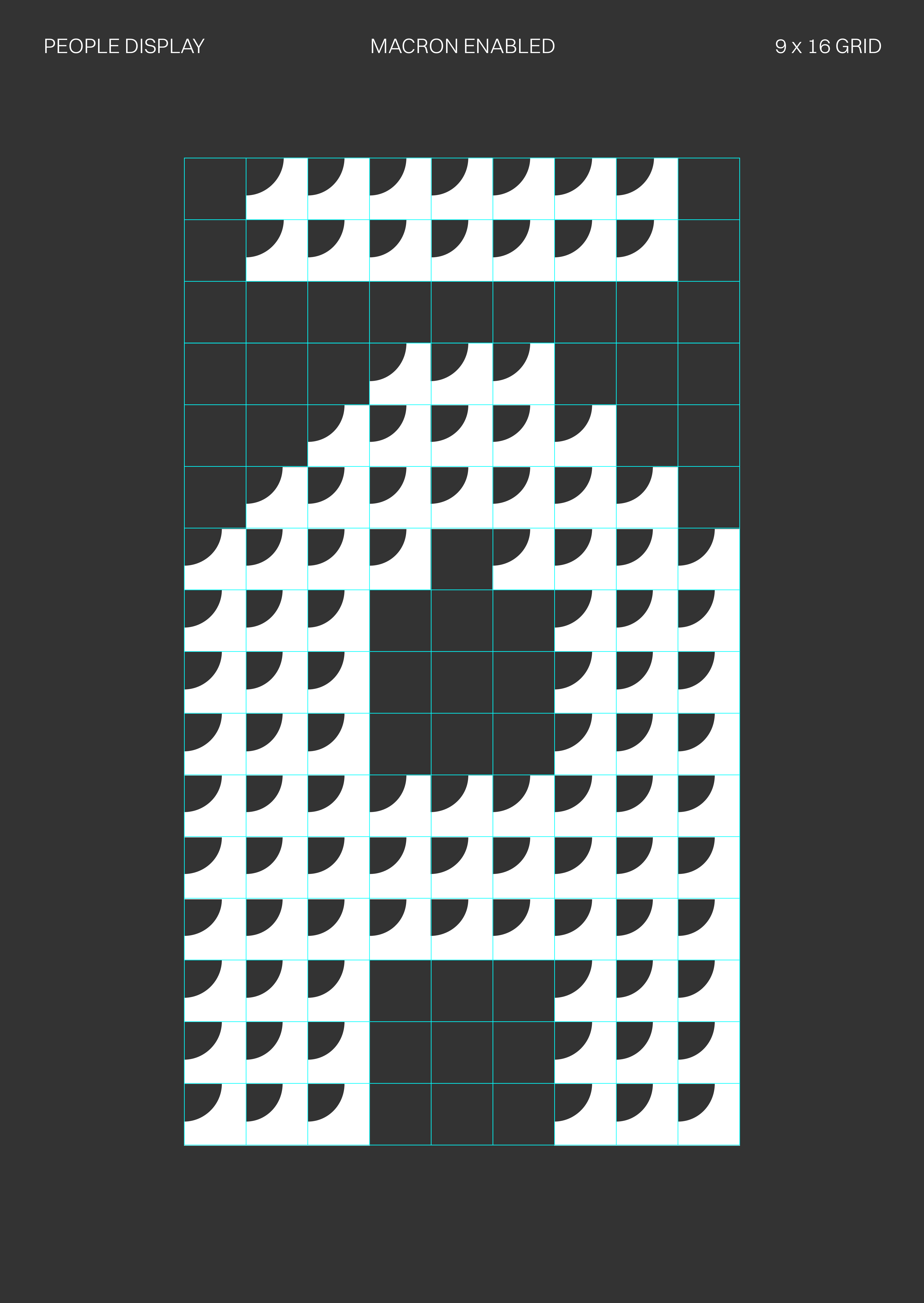
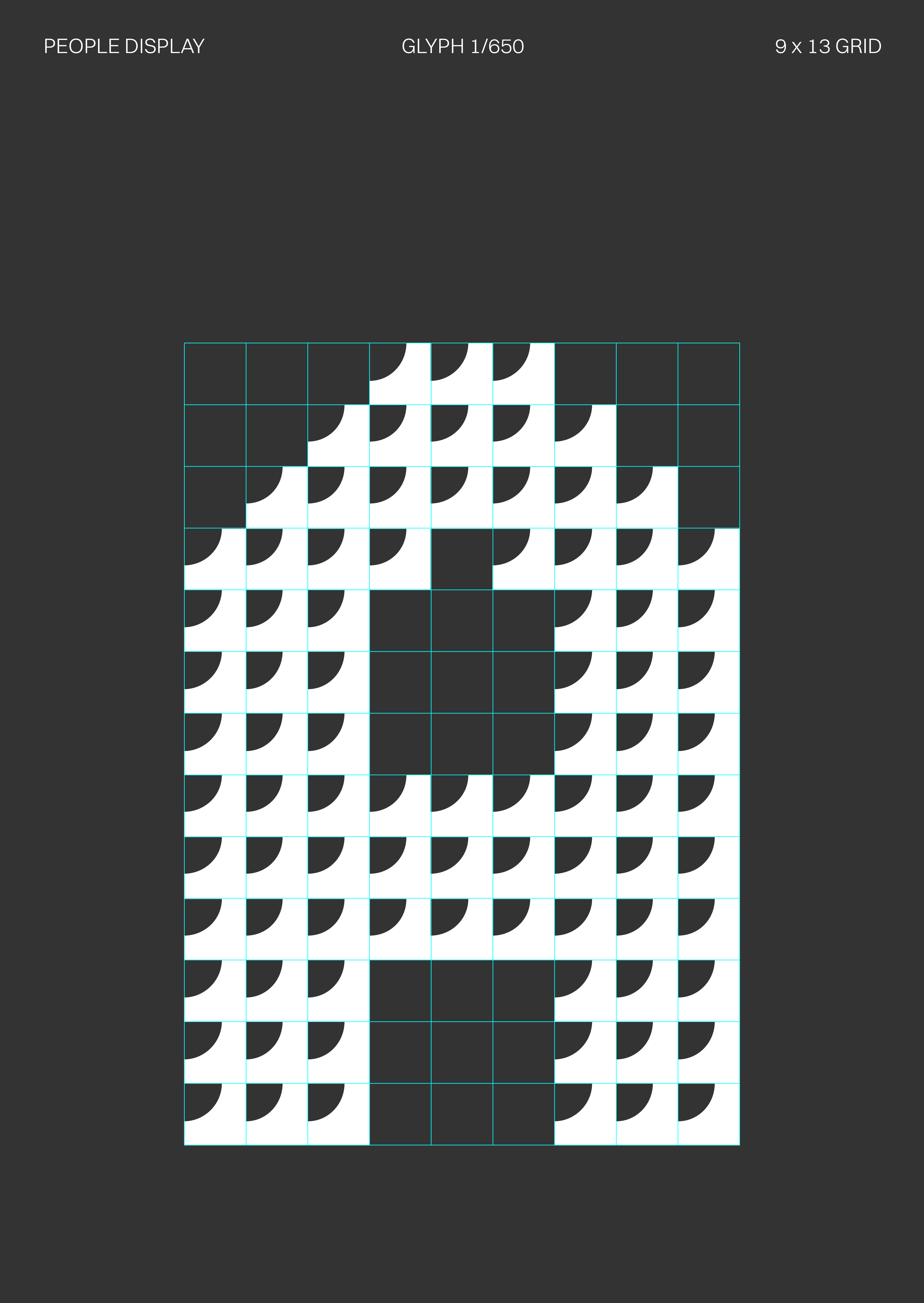
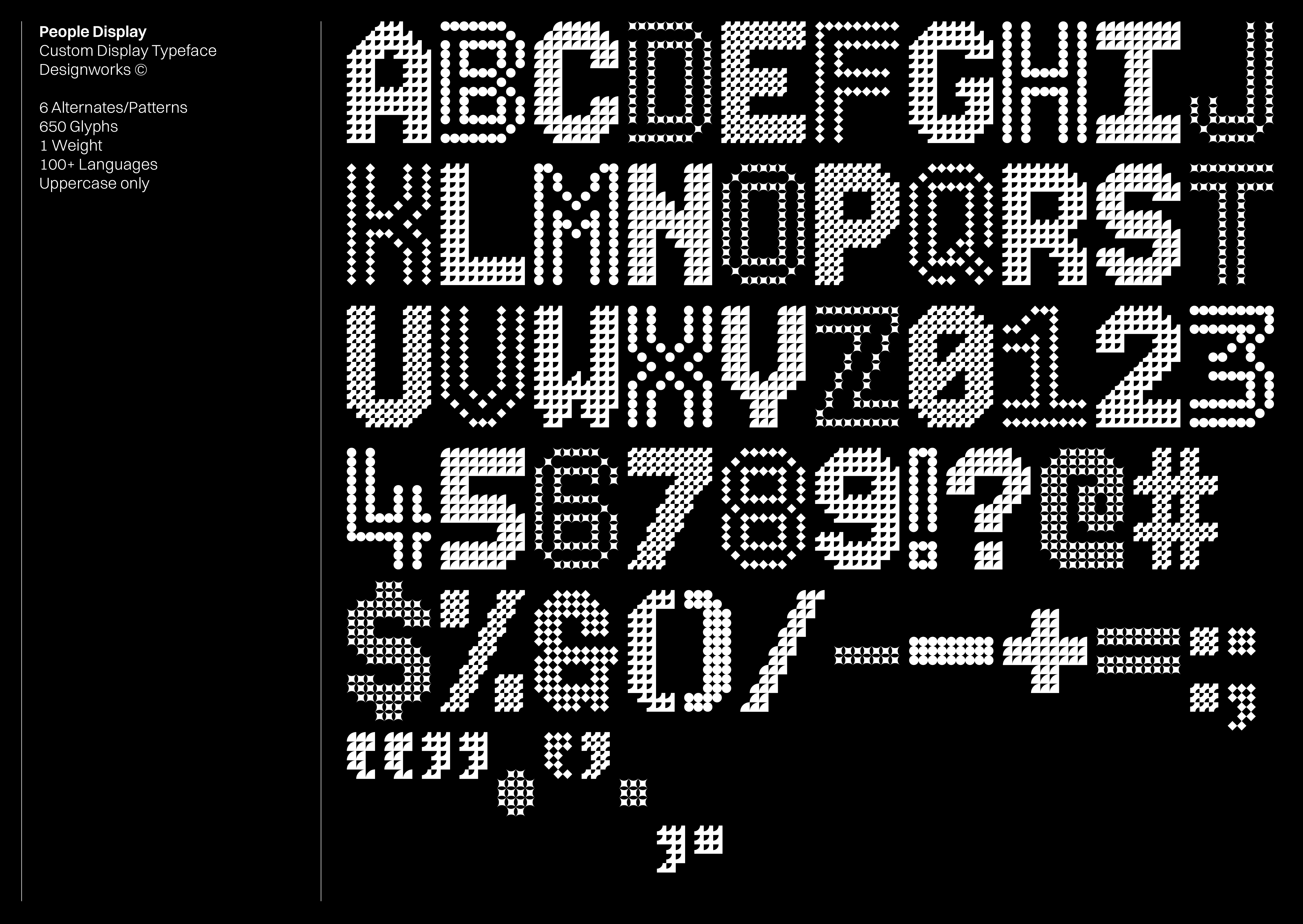
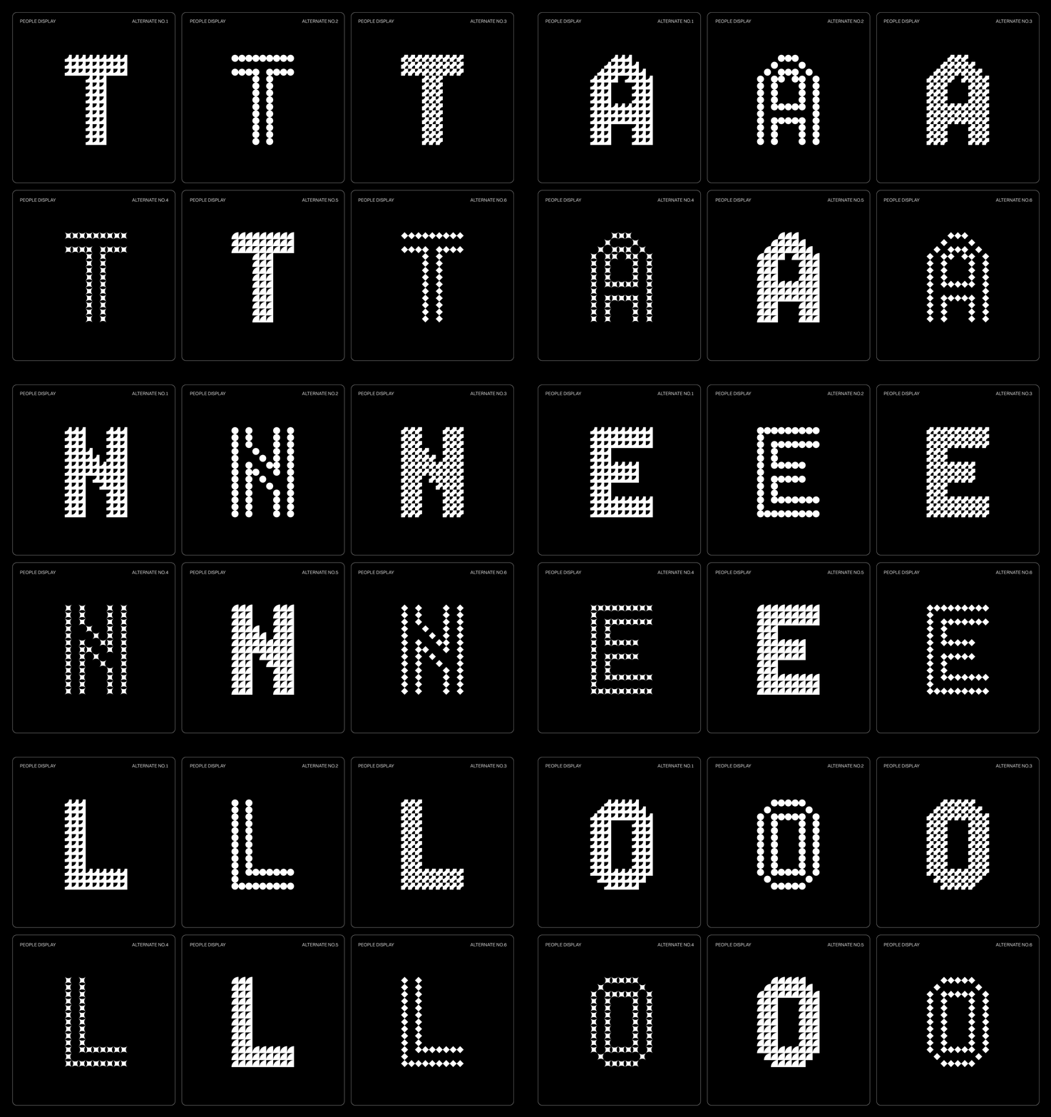
To reinforce distinctiveness, we created People Display, a custom typeface. This font extends the logotype's visual language, incorporating six interchangeable patterns within each character. Its OpenType feature dynamically shifts, reflecting diversity.
Designed for high-impact headlines, People Display ensures the message is delivered with authority. For body text, Switzer provides accessible, clear readability.
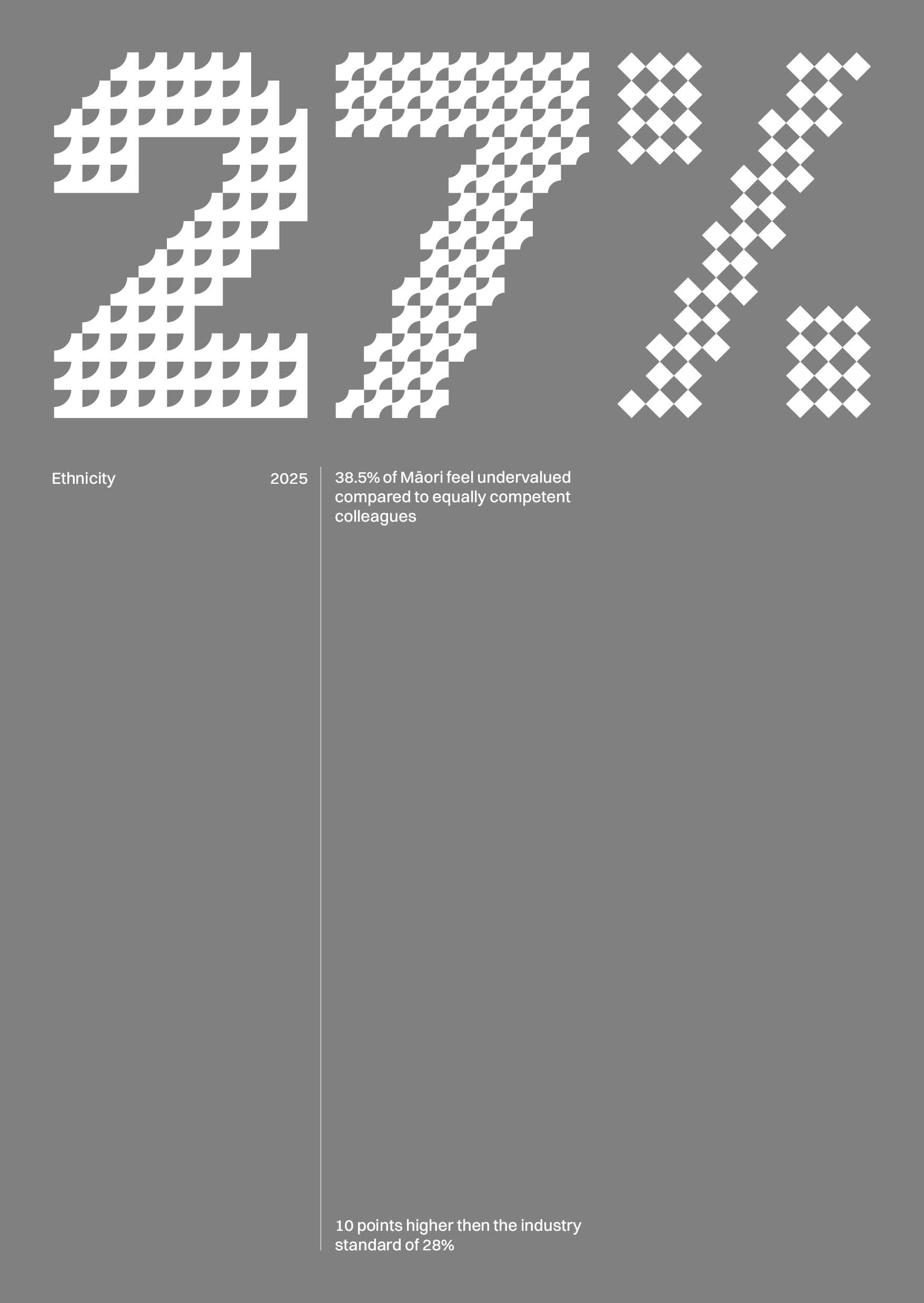
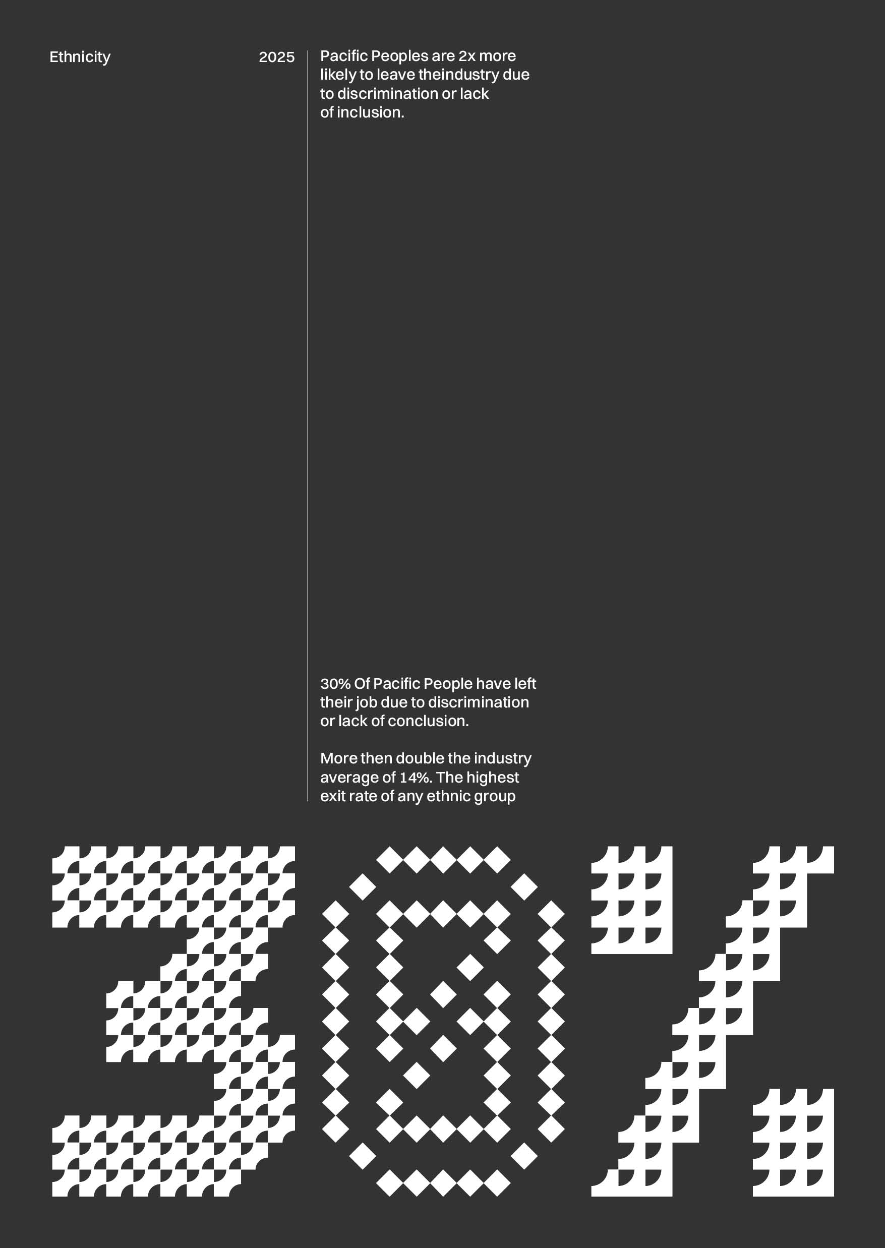
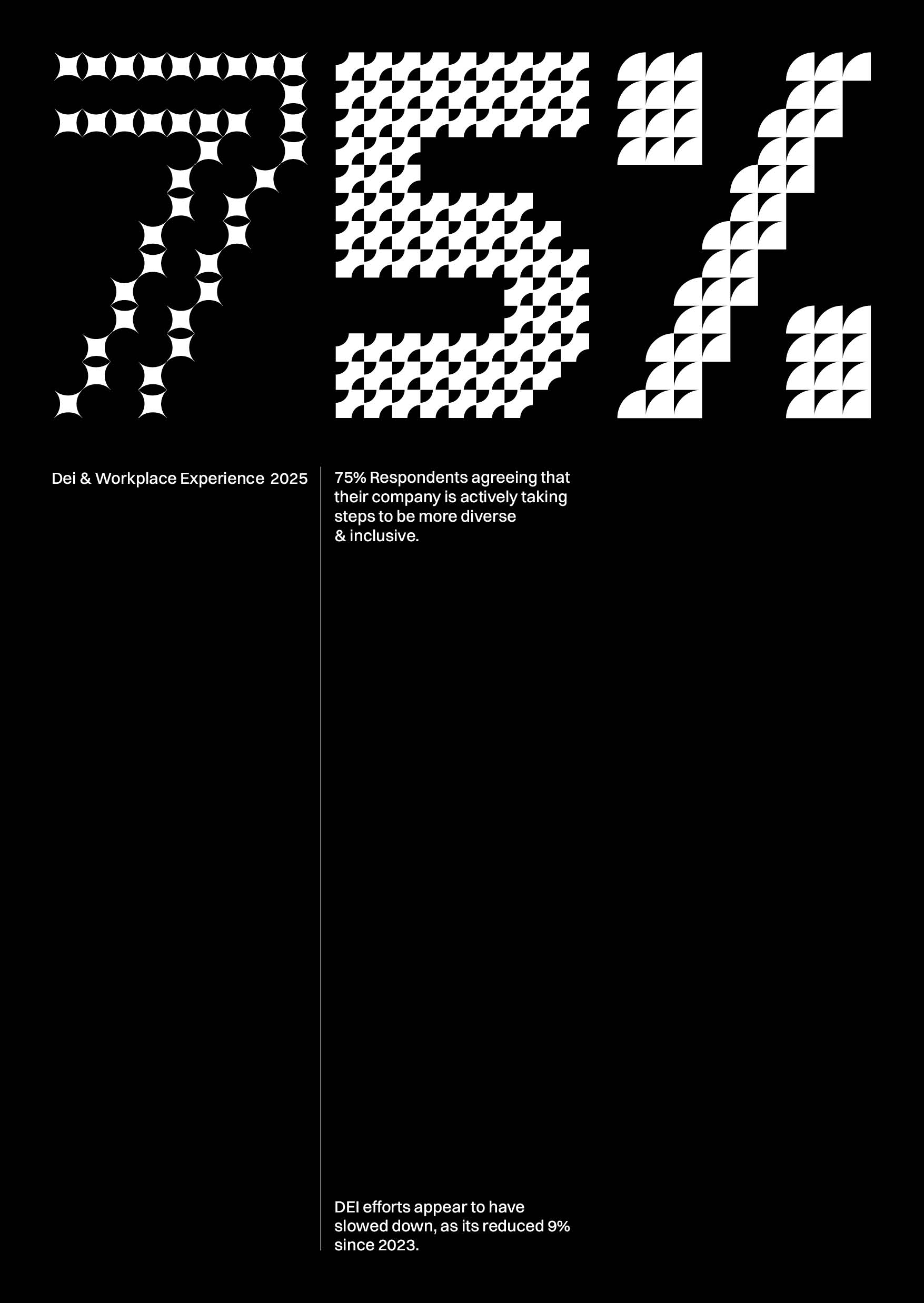
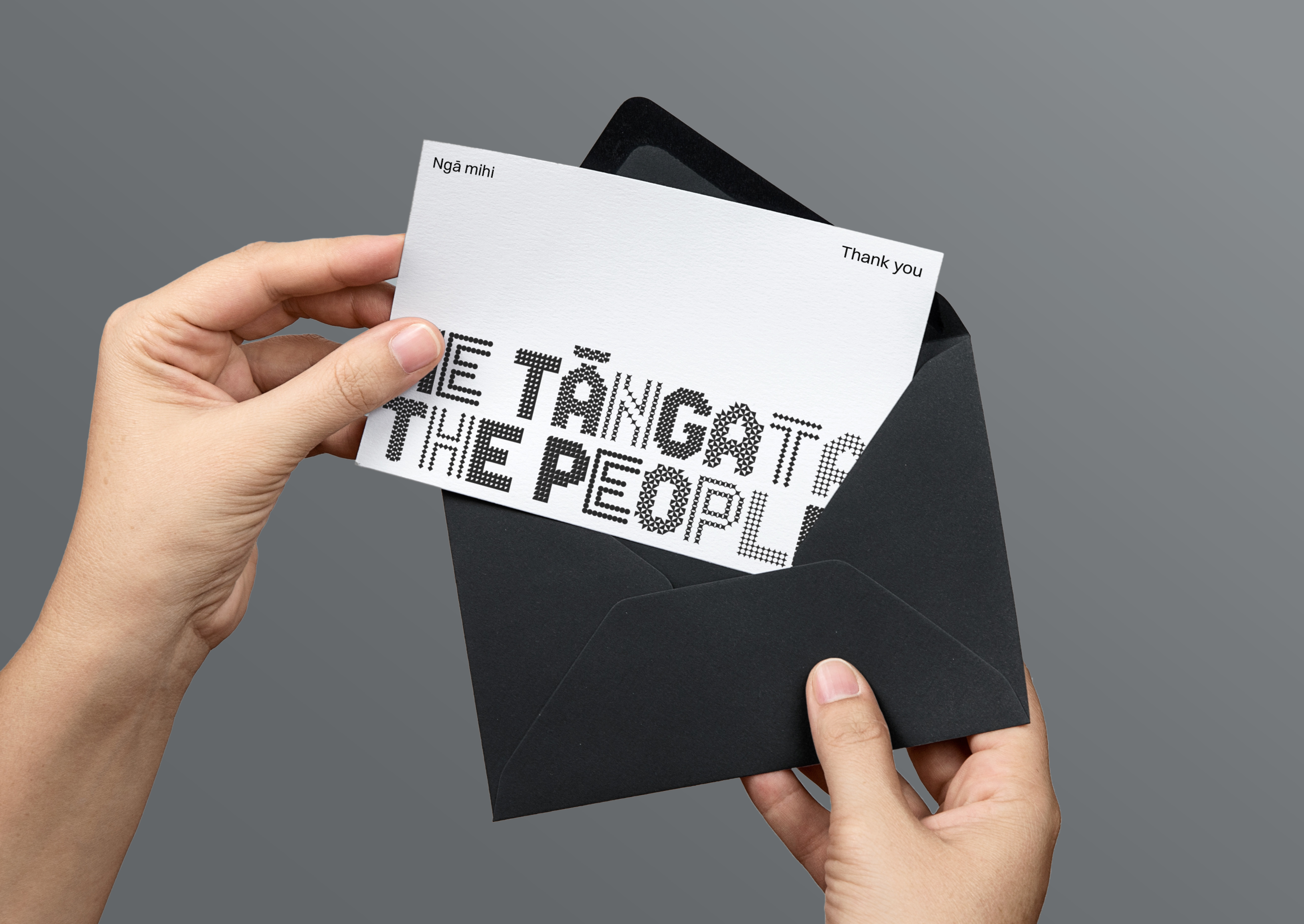
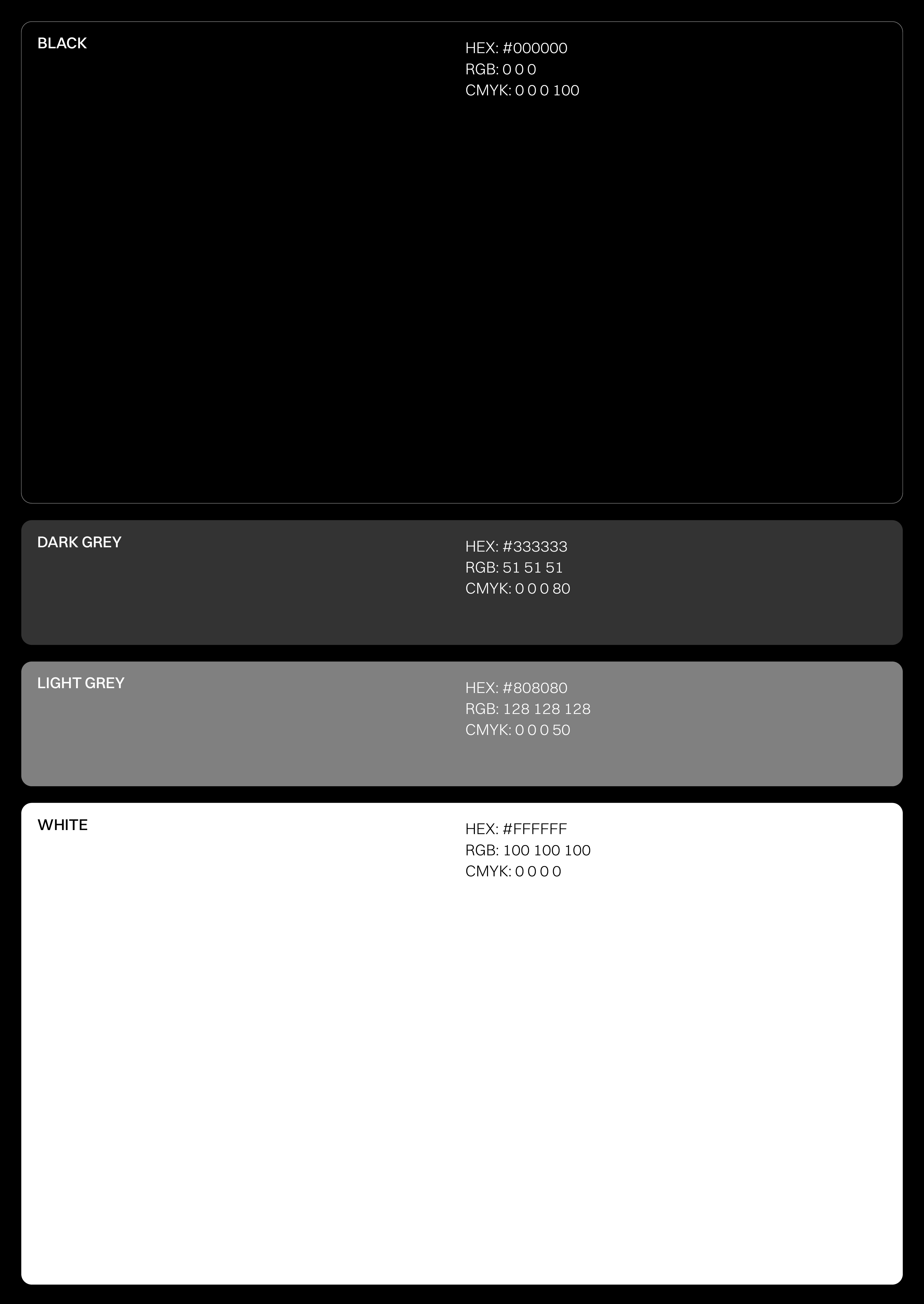
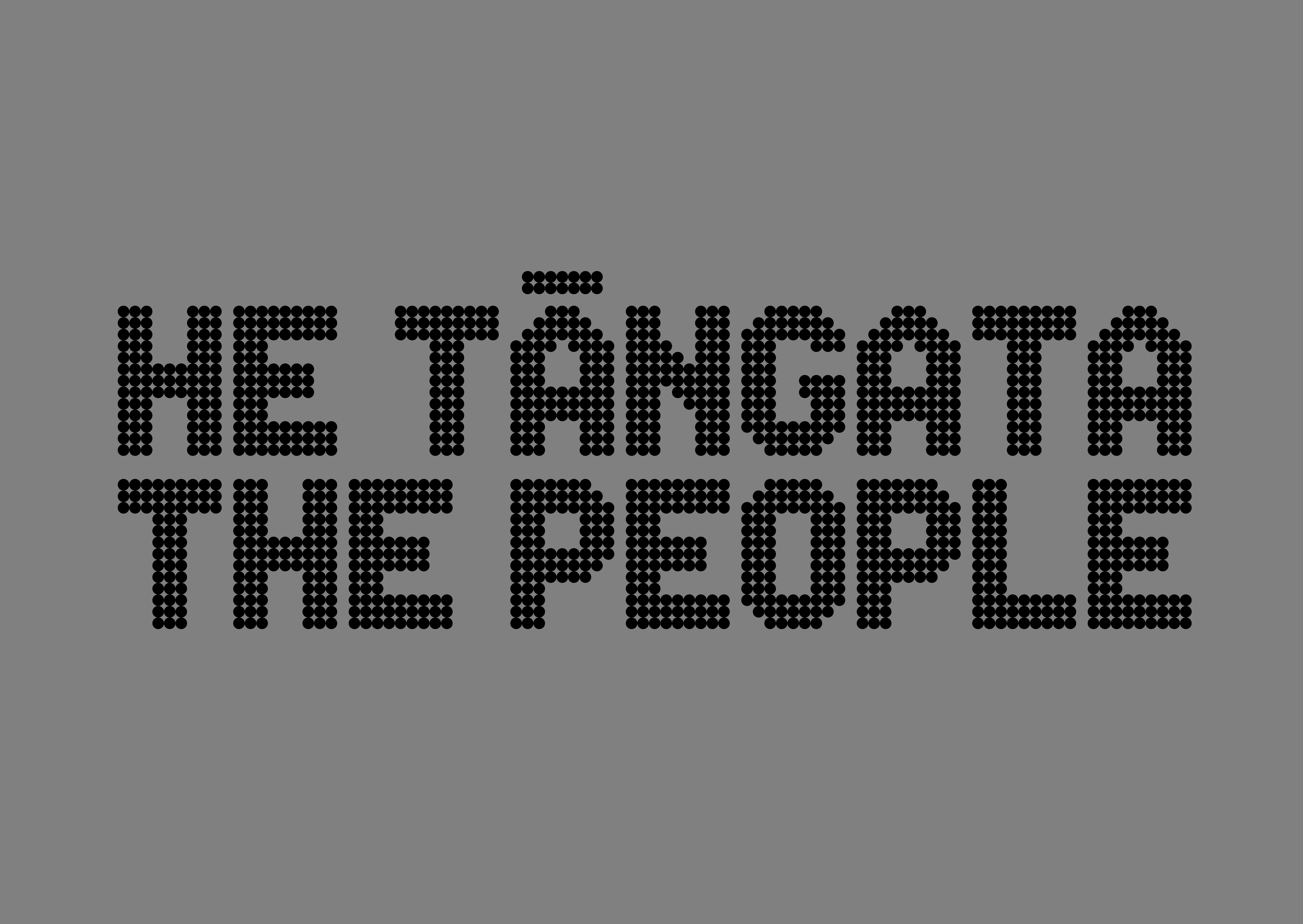
Our colour palette is paired back: black and white, reflecting Aotearoa and the brand's bold simplicity. We introduced a spectrum of neutral greys to add depth and flexibility, acknowledging that the grey area is where we truly thrive. This expanded palette ensures visual harmony and accessibility, complementing existing industry initiatives by framing their unique expressions within the He Tāngata context.
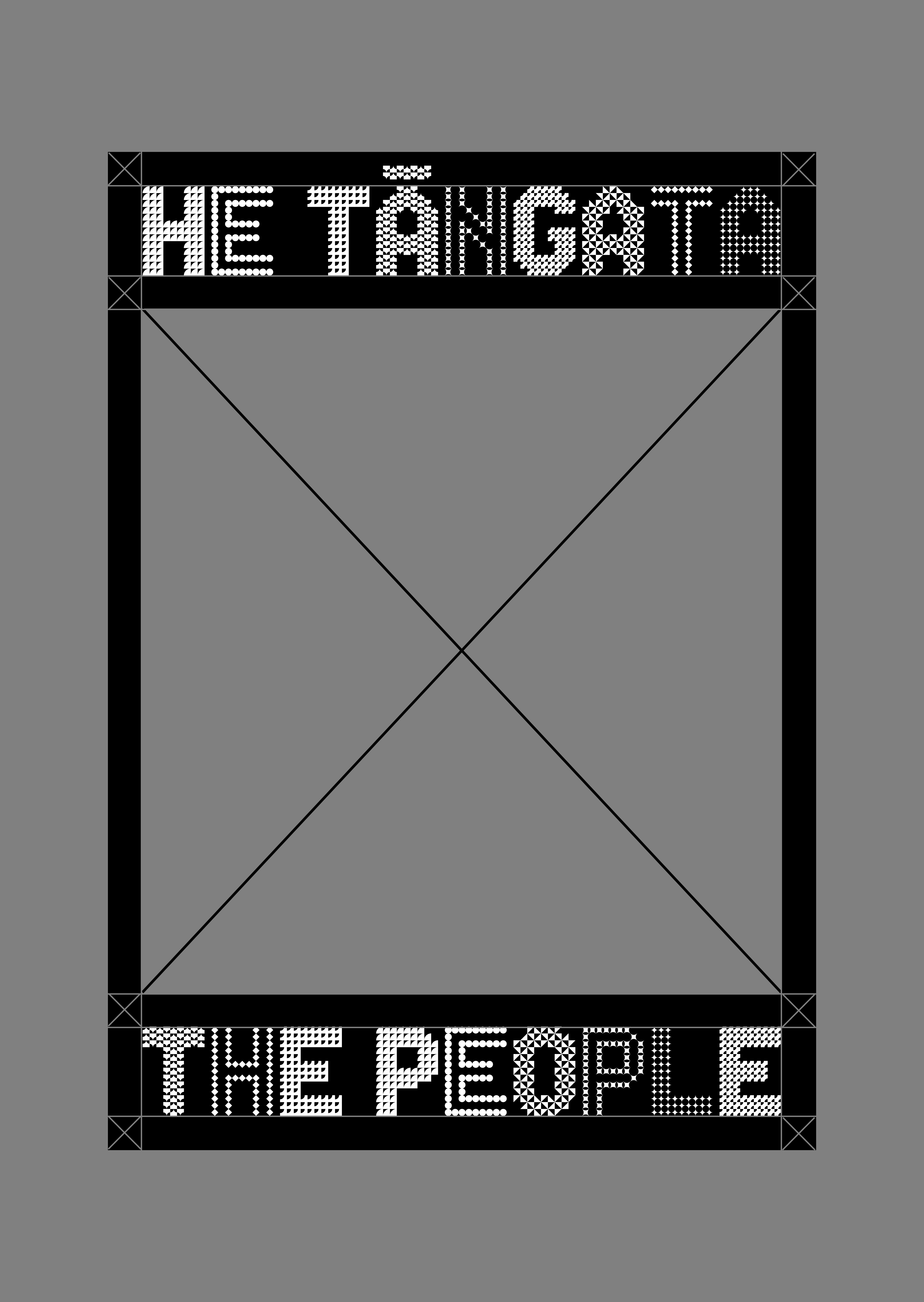
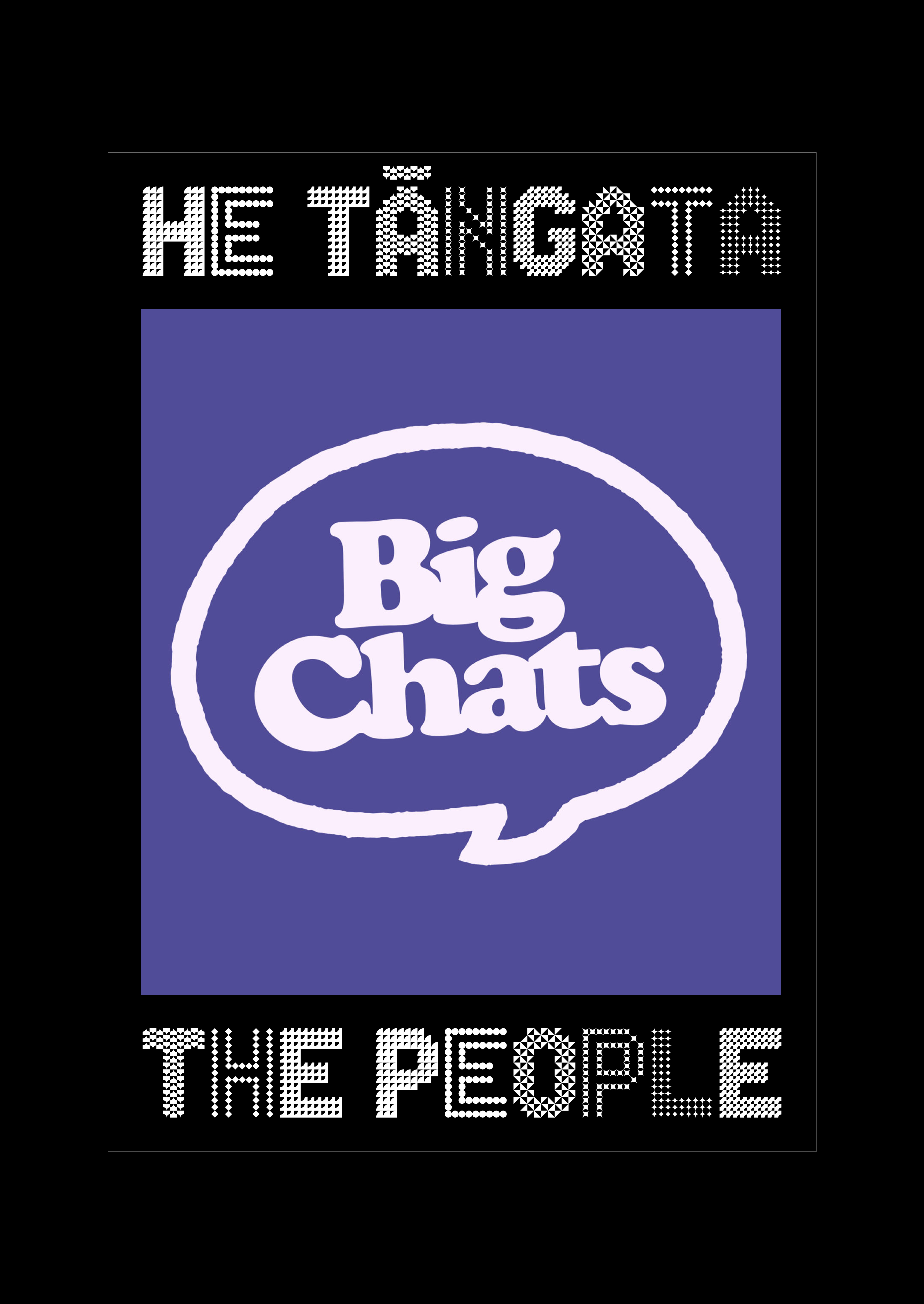
The geometric shapes and logotype form a flexible framework
for content. A framing device consistently houses people and imagery, ensuring faces and identities are always visible and respected. It's a practical application of the brand's core value: putting people at the centre.
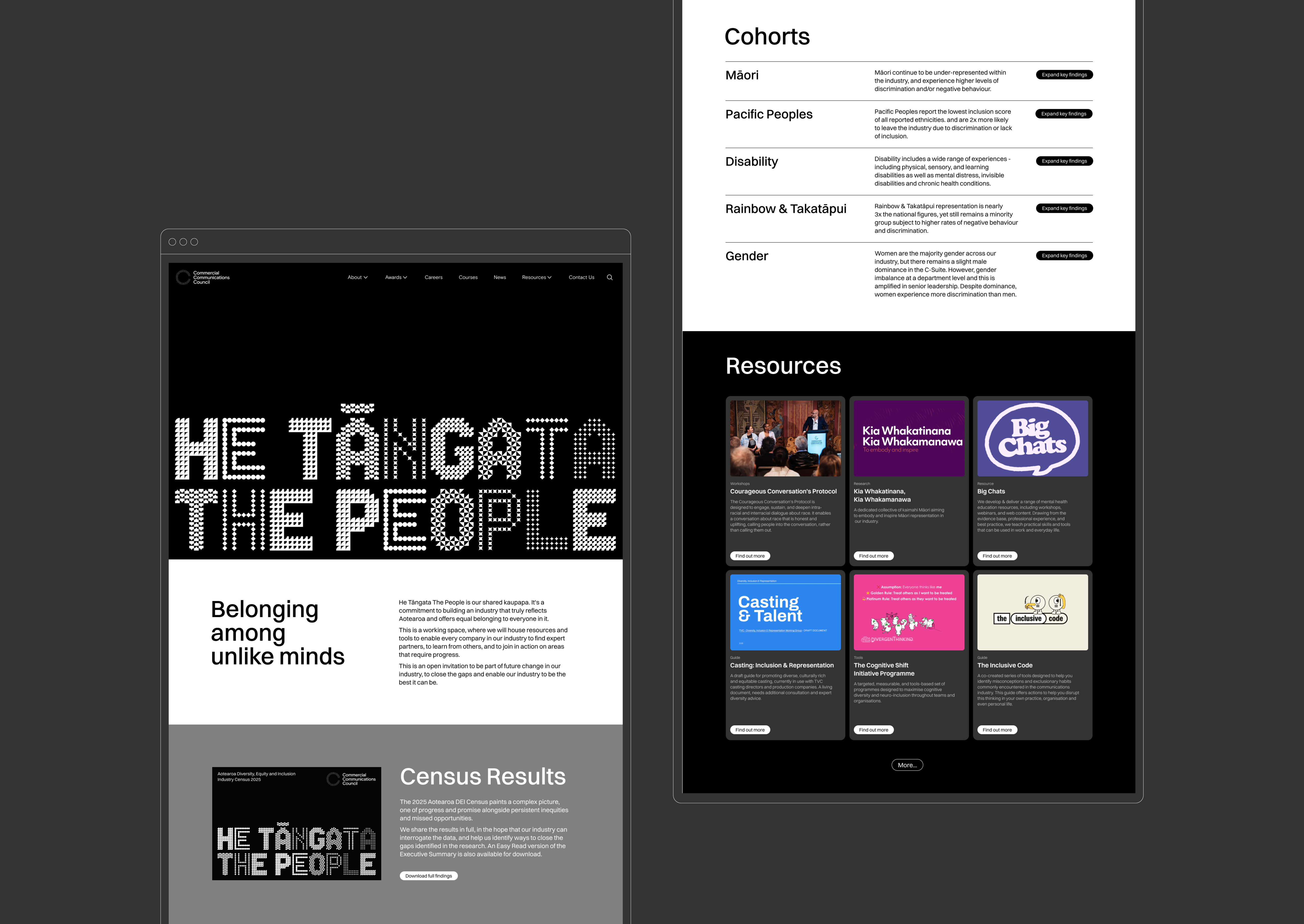
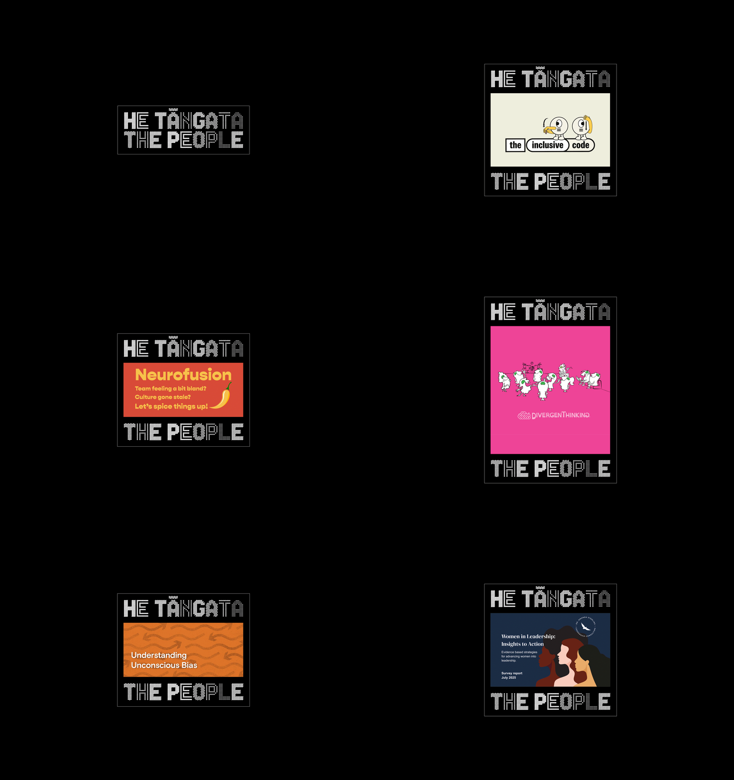
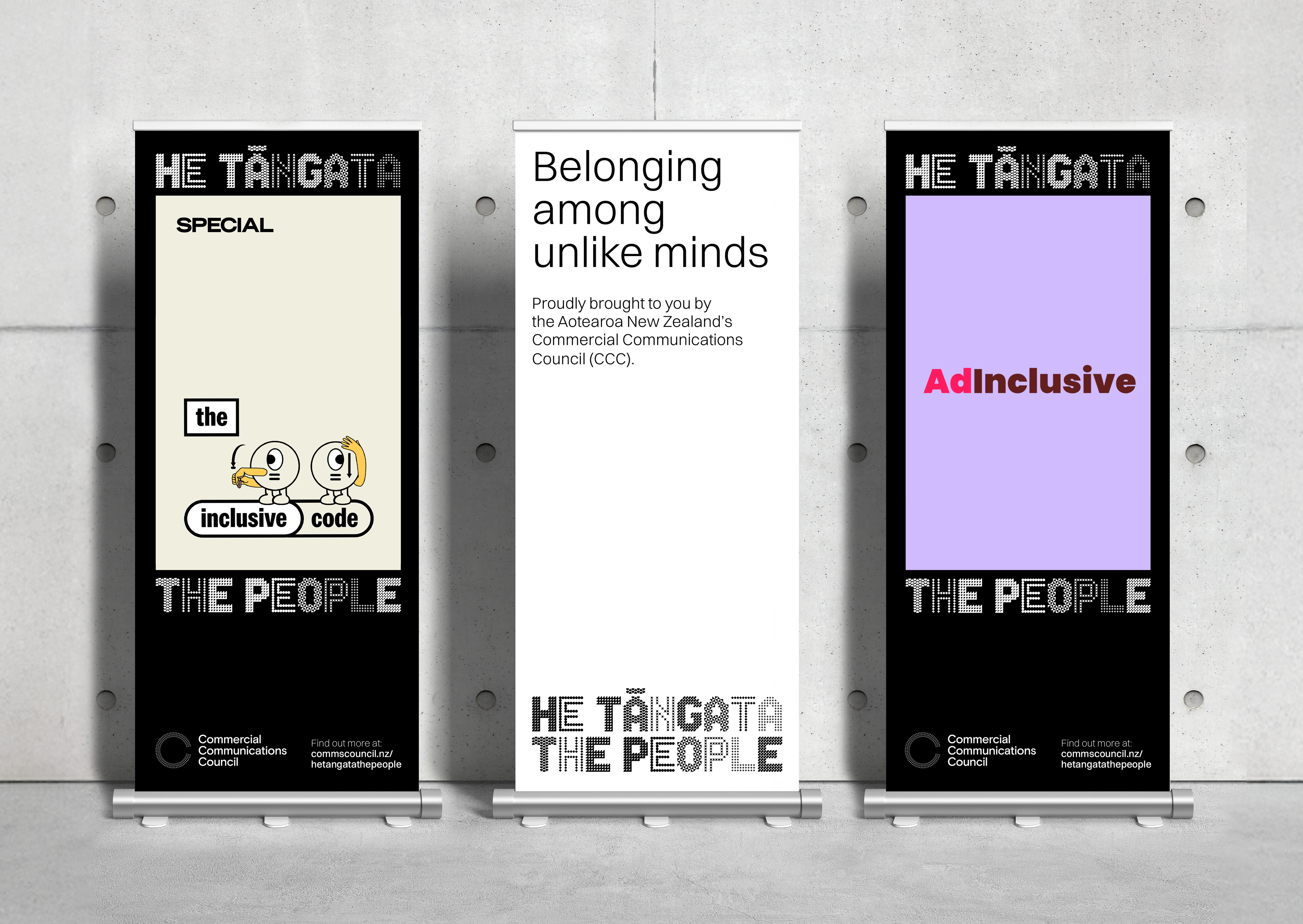
The He Tāngata | The People identity is built for comprehensive application. From digital platforms and social media to event signage, print, and internal communications, its modularity ensures dynamic layouts.
He Tāngata | The People is a living system built to hold space for every voice.
Acknowledgements
Designworks
Jef Wong, Celine Giovanni, Jonathan Beunaobra, Tai Poppleton, Phillip Kim, Mike Pepper, Nicky Lloyd
Partners
Katene Durie Doherty, Grace Stratton, Jax Kenrick, Genevieve Mora, Stella Muller
Client
Commercial Communications Council
Client Lead
Simon Lendrum